What Does Complementary Style Mean in Fashion?
Complementary style in fashion is defined as pairing colors that sit directly opposite each other on the 12-step color wheel, such as red and green, blue and orange, or yellow and purple. These pairings create high-contrast, visually vibrant looks because the human eye amplifies the intensity of each color when placed next to its opposite. The result is an outfit that feels deliberate, bold, and polished rather than accidental. Color theory has guided artists and designers for centuries, and fashion stylists now apply the same principles to build outfits that command attention. Understanding what complementary style means gives you a real framework for getting dressed with intention.
What does complementary style mean in fashion?
Complementary style is rooted in color theory, the same discipline that painters and graphic designers use to control visual impact. On a standard color wheel, complementary colors are positioned exactly 180 degrees apart. That geometric relationship is not decorative. It produces a specific optical effect called simultaneous contrast.
Simultaneous contrast means each color makes its opposite appear more saturated and vivid. Place a blue garment next to an orange one, and both colors look more intense than they would in isolation. The human eye amplifies contrast in these pairs, which is why complementary outfits feel energetic and attention-grabbing. This is also why sports teams, brand logos, and stage costumes so often rely on complementary pairings.
The three primary complementary pairs in fashion are:
- Red and green: Festive and bold, often softened with muted or earthy tones to avoid a holiday-costume effect
- Blue and orange: One of the most wearable pairings, especially in navy-and-rust or sky-blue-and-burnt-orange combinations
- Yellow and purple: High drama when fully saturated, more wearable when one shade is softened to mustard or lavender
Color psychology reinforces why these pairings work beyond optics. High contrast signals confidence and intentionality. An outfit built on complementary colors reads as considered, not thrown together. That visual signal matters whether you are dressing for a job interview, a first date, or a weekend market.
How to wear complementary style without overdoing it
The most common mistake with complementary dressing is treating both colors as equals. Fashion stylists recommend avoiding a 50/50 split of equally saturated colors. That balance creates visual tension without resolution, and the outfit can feel aggressive or chaotic.
The fix is proportion. Use one color as the dominant and let the second play a supporting role. A practical breakdown looks like this:
- 70/30 rule: Let one color cover roughly 70 percent of the outfit. Use the complementary color for the remaining 30 percent through a jacket, bag, or shoes.
- Mute one side: If you wear a fully saturated cobalt blue top, pair it with a burnt orange rather than a neon orange. Muting one color prevents the outfit from competing with itself.
- Use accessories as accent points: A bold red bag against an all-green outfit delivers the complementary pop without overwhelming the look. Accessories often serve as the most effective area for complementary color accents.
- Match color temperature: Warm tones (reds, oranges, yellows) pair more cohesively with other warm tones. Cool tones (blues, purples, blue-greens) work best together. Matching color temperature across outfit pieces improves internal cohesion and prevents a fragmented look.
- Match saturation levels: A pastel top paired with a deeply saturated complementary bottom creates imbalance. Keep both pieces at a similar level of intensity, or deliberately mute one for contrast.
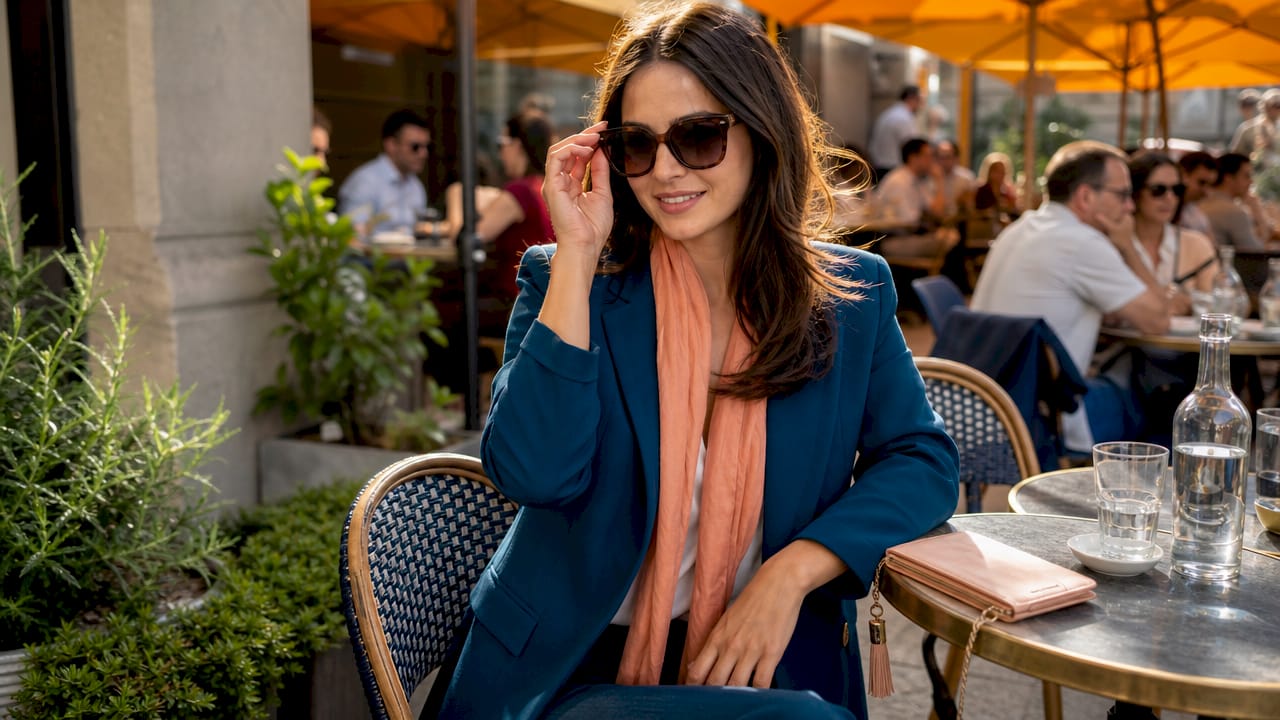
Pro Tip: Start with one bold complementary piece, such as a cobalt blue blazer, and build the rest of the outfit in neutrals. Add the complementary accent, burnt orange in this case, through a single accessory. This approach gives you the visual payoff without the risk of overload.
Color saturation and lightness are crucial to making bold complementary pairings feel sophisticated rather than jarring. Tints (colors mixed with white) and shades (colors mixed with black) of complementary pairs are far more wearable than their fully saturated versions. Blush pink and sage green, for example, deliver the same complementary structure as red and green but with a fraction of the visual intensity.
How does complementary style compare to analogous and monochromatic looks?
Understanding complementary style becomes clearer when you place it next to the two other major color schemes used in fashion. Each scheme suits different fashion intentions and moods, so knowing when to use each one is as useful as knowing how.
Analogous color schemes use colors that sit next to each other on the color wheel, such as yellow, yellow-green, and green. The result is harmonious and easy on the eye. Analogous outfits feel cohesive and calm. They work well for professional settings or when you want a put-together look without visual drama.
Monochromatic schemes use a single color in different tints, shades, and textures. An all-navy outfit with a light blue shirt and dark navy trousers is monochromatic. The effect is unified and elegant. Monochromatic dressing is forgiving because there is no color clash risk.
Color scheme Contrast level Visual effect Best for Complementary High Bold, vibrant, attention-grabbing Events, statement looks, creative settings Analogous Low Harmonious, calm, cohesive Professional wear, everyday polish Monochromatic None Unified, elegant, simple Minimalist style, formal occasions
Complementary style delivers the highest contrast of the three. That is its strength and its challenge. When you want your outfit to make a statement, complementary color combinations are the right tool. When you want to blend in or project quiet authority, analogous or monochromatic schemes serve better.
What are split-complementary and tetradic color schemes?
Once you are comfortable with basic complementary pairings, two advanced variations offer more depth and flexibility. Both expand on the core concept without abandoning it.
Split-complementary uses one base color plus the two colors adjacent to its direct complement. Instead of blue and orange, you would pair blue with yellow-orange and red-orange. The effect is softer contrast than a direct complementary pair, which makes it more forgiving for daily wear. You still get visual complexity and interest, but the tension is reduced. A dusty blue dress with terracotta and peach accessories is a real-world split-complementary outfit.
Tetradic schemes use two complementary pairs simultaneously. Blue and orange plus yellow and purple, for example. This creates the richest color palette of any scheme, but it also carries the highest risk of visual clutter. Tetradic schemes require careful balancing to avoid looking chaotic.
Practical rules for working with these advanced schemes:
- Anchor with a neutral: When using split-complementary or tetradic combinations, add a neutral base such as white, black, gray, or camel to give the eye a resting point.
- Limit fully saturated colors to one: In a tetradic outfit, let one color be bold and keep the other three muted or used in small doses.
- Test with accessories first: Before committing to a full tetradic outfit, try the four-color combination in accessories only. Scarves, bags, shoes, and jewelry let you experiment at low risk.
- Prioritize wearability: Split-complementary schemes are well-suited for high-visibility contexts like public appearances or events, but mastering the basics first prevents visual clutter in everyday wear.
Pro Tip: For a split-complementary look that works immediately, try a forest green outfit with rust-orange shoes and a golden-yellow bag. The three colors create warmth and complexity without the sharpness of a straight green-and-red pairing.
The mix and match approach used in swimwear styling applies the same split-complementary logic. Pairing a solid-color piece with two adjacent accent tones creates visual interest while keeping the overall look balanced.
Key Takeaways
Complementary style works because opposite colors on the color wheel amplify each other’s intensity, and controlling proportion and saturation turns that contrast into a polished, deliberate look.
Point Details Core definition Complementary style pairs colors directly opposite on the color wheel for maximum contrast. Proportion rule Use a 70/30 split with one dominant color to avoid an aggressive or chaotic outfit. Saturation control Mute one color or use tints and shades to keep bold pairings wearable and sophisticated. Advanced schemes Split-complementary and tetradic variations add complexity with softer or richer contrast. Scheme selection Choose complementary for bold statements, analogous for harmony, and monochromatic for simplicity.
Why I think most people are one accessory away from mastering this
Most shoppers already own complementary color combinations without realizing it. A navy coat and a rust-orange scarf. A green dress with a burgundy bag. The pairing works, but it often feels accidental rather than intentional. That gap between accidental and deliberate is where real style lives.
The mistake I see most often is reaching for full saturation on both sides. Someone buys a bright cobalt blue top and pairs it with a neon orange skirt, then wonders why the outfit feels overwhelming. The colors are correct. The execution is off. Dialing one color back to a muted or tonal version fixes the problem immediately.
What I find most rewarding about complementary dressing is the visual dialogue it creates. The outfit feels like it has something to say. That quality is hard to achieve with safe, neutral dressing. Complementary color combinations make an outfit feel considered and confident without requiring expensive pieces or complex layering.
My practical advice is to start with one complementary pair you already own and wear it with intention. Notice how people respond. Then experiment with muting one side, shifting to a split-complementary variation, or introducing a complementary accent through a single accessory. Build the skill gradually. The color and fit principles behind great outfits are learnable, and complementary style is one of the fastest ways to see a visible improvement in how your wardrobe performs.
— admin
How Clothme helps you put complementary style to work
Knowing the theory is one thing. Finding clothes that actually fit your body and match your color preferences is another challenge entirely.
Clothme lets you upload two photos to generate a personal size profile, then filters your shopping feed to show only products that match your individual style, color preferences, and fabric choices. If you are building a wardrobe around complementary color combinations, Clothme surfaces pieces that work with what you already own rather than adding more items that never get worn. You can also save size profiles for family members, which makes shopping for complementary-styled outfits for everyone far less complicated. Start building your wardrobe with color combinations that actually work for your body and your style.
FAQ
What does complementary style mean in fashion?
Complementary style in fashion means pairing colors that sit directly opposite each other on the color wheel, such as blue and orange or yellow and purple, to create a high-contrast, visually vibrant outfit.
What is the 70/30 rule in complementary dressing?
The 70/30 rule means letting one color dominate about 70 percent of the outfit while using the complementary color for the remaining 30 percent through accents or accessories. This proportion prevents the look from feeling aggressive or visually chaotic.
How is complementary style different from analogous style?
Complementary style uses colors opposite on the color wheel for maximum contrast, while analogous style uses colors adjacent to each other for a harmonious, low-contrast look. Complementary suits bold statements; analogous suits everyday polish.
Can I use complementary colors without looking overdressed?
Yes. Muting one of the two colors, using tints or shades instead of fully saturated versions, or limiting the complementary accent to a single accessory keeps the look wearable for everyday settings.
What is a split-complementary color scheme?
A split-complementary scheme uses one base color plus the two colors adjacent to its direct complement, producing softer contrast than a straight complementary pair while still delivering visual complexity and interest.