Shoppers: Color Analysis for Clothes + Saved Sizes in 2 Minutes
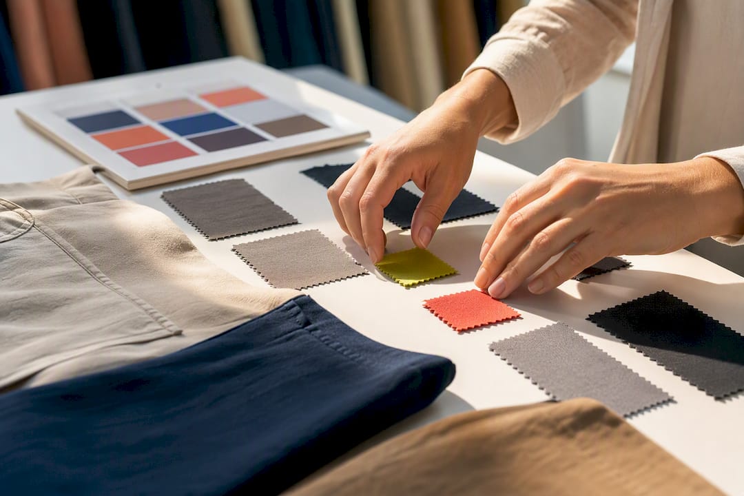
Color analysis for clothes, in the context of a fashion marketplace, means software scans a product photo, identifies the garment’s dominant color, and tags it with a label you can filter by, like “olive” or “burgundy.” You save your preferred colors once, and the platform shows you only matching items. Paired with a saved size profile, that filter turns a catalog of thousands into a short list of things that actually fit and look like you’d wear them.
TL;DR:Automated color analysis uses machine learning to accurately identify dominant fabric shades, reducing misclassification caused by lighting, fabric patterns, or near-neutral tones.
Combining automated color tags with personalized size profiles significantly narrows product lists, leading to faster shopping and fewer wrong-size or wrong-color purchases.
Misclassifications mainly occur due to lighting variations, ambiguous colors, and patterned fabrics, so users should verify tags with multiple photos and HEX codes when possible.
Saving a diverse palette of shades and updating it seasonally improves filter accuracy, making it easier to find items that match existing wardrobe colors.
Proper use of combined filters and quick pre-purchase checks can minimize returns caused by color mismatches, especially when filtering for family wardrobe coordination.
Clothme
clothme.io
Find Clothes Matched to You
ClothME uses two photos to create personalized size profiles and helps you find styles, colors, and fabrics that suit your preferences.
Explore ClothME
Table of Contents
Personal Color Theory vs. Product Color Tags: What’s Different
Building a Color Palette That Actually Reflects What You Buy
How Automated Color Analysis Works
The process starts before color even gets measured. An algorithm first has to figure out which pixels in a photo actually belong to the garment, ignoring the model’s skin, the background, and any shadows. This step, sometimes called region-of-interest detection, matters because a white studio backdrop can easily get miscounted as part of a light-colored shirt if the system isn’t careful about isolating fabric.
Once the relevant pixels are isolated, most systems don’t work in plain RGB, the red-green-blue values your monitor uses. They convert to a perceptual color space like CIE-Lab, which mirrors how human eyes actually judge color differences. A Springer chapter on machine learning-based color recommendation describes exactly this approach: build a color-class profile vector from Lab values, then group hundreds of raw shades into a smaller set of usable categories. That grouping step is what lets a platform show you a filter for “navy” instead of forcing you to scroll past 40 barely distinguishable blues.
Clustering algorithms, K-means being the most common, then find the dominant clusters of color within that fabric region. The centroid of the biggest cluster becomes the item’s primary color reading.
Here’s where it gets practical for shoppers:
Hierarchical mapping classifies broadly first (red, blue, green, neutral) before drilling into a specific label like “burgundy” or “navy,” which practitioners find cuts down on labeling errors for tricky, closely related shades.
Palette curation limits the final label set to something like 15 to 30 names instead of exposing every technical hue, since you filter by “green,” not by a six-digit hex code.
Pattern and fabric analysis helps the system decide when a busy print should get one dominant-color tag versus a multi-color label.
Manual vendor metadata still gets used alongside automated tags on many platforms, since a seller’s own color name can catch context a model misses.
A 2025 paper on AI-driven undertone and palette detection notes that converting these clustered Lab values into HEX or named swatches is what makes real-time, color-based product retrieval possible at all.
Why Color-Filtered Shopping Actually Reduces Returns
Color is usually the first thing you judge in a product photo, often before you even check the price. That’s why a filter that actually understands color, not just a text search on the product title, changes how fast you find something worth buying.
Machine learning-based color recommendation engines have been shown to outperform random or generic estimation on large retail datasets when color-class vectors are combined with personalization signals, according to the same Springer research.
Layer a saved size profile on top of a color filter and the math gets even better. Instead of browsing hundreds of shirts hoping one is both the right hue and the right cut, you land on a feed that’s already narrowed by both. That’s especially useful for coordinating family wardrobe purchases, where you might be hunting for matching-but-not-identical outfits for three different people at once. A separate case study on automated tagging at the marketplace Willhaben found that better color and pattern tags sped up listing searchability for buyers browsing user-generated inventory, which points to the same underlying benefit: tighter tags mean less scrolling and fewer wrong guesses at checkout.
Where Color Tags Get It Wrong (and How to Read Them)
No automated system nails color perfectly every time, and knowing why helps you shop smarter instead of getting frustrated by a mismatch.
Lighting is the biggest culprit. A studio shot under cool white balance can make a warm brown read closer to gray, while a lifestyle photo taken outdoors in golden-hour light can push a true black toward deep charcoal. The Styloscape research flags lighting variation and inconsistent training data as two of the main reasons automated palette detection still misfires on certain images.
Muted and near-neutral tones are the second problem area. When a color sits right on the boundary between two labels, say a grayish blue that could reasonably be called “slate” or “navy,” classifiers tend to default to the broader, safer group. Small patterns compound this: a fine houndstooth or a subtle stripe can confuse dominant-color detection entirely, since the system is essentially trying to average two or three colors into one label.
A few habits protect you here:
Look at more than one product photo before trusting a single color tag.
Check for a HEX code or color swatch if the listing offers one, since that’s a more precise reading than a text label.
Read the fabric or material note, which sometimes clarifies shade in ways the image alone can’t.
Use any “report a color issue” or override option if a tag looks clearly wrong.
Pro Tip: Pull up a product photo next to a neutral white background, like a blank note on your phone, before deciding if that “teal” is closer to your idea of teal or actually leans green. Screen brightness alone can shift how a color reads.
How to Use Color Filters Step by Step
Getting the most out of a color-filtered feed takes about two minutes of setup, and it pays off every time you shop afterward.
Save more than one shade per color family. Instead of tagging yourself as a “blue” shopper, add a few representative swatches, like navy, cobalt, and slate, so the filter captures your actual range instead of one narrow interpretation.
Apply your saved size profile at the same time as your color filter. Running both together, rather than filtering by color first and checking size later, cuts out items you’d have to reject anyway.
Start broad, then refine. Pick the general color group first, narrow by specific shade or fabric next, and finish by sorting for size availability so you’re not comparing items that are already out of stock in your size.
Use “similar shades” or compare tools when they’re available. These features let you see near-matches side by side instead of relying on memory to judge whether two tagged colors are actually close.
Do one last visual check before checkout. Even a well-tagged item benefits from a quick look at the actual photo, since tags describe a category, not the exact shade rendered on your screen.
Switching between recipients matters here too. If your marketplace supports family profiles, swapping the active profile before you filter means you’re always browsing against the correct saved sizes, not guessing which child’s measurements you last entered.
Family Shopping: Color Preferences Tied to Saved Profiles
Shopping for a household is a different problem than shopping for yourself, and color tagging only earns its keep when it’s paired with per-person data. A marketplace that lets you save a named palette for each family member, something like “Sam, school blues and grays” or “Mom, warm neutrals,” turns a generic catalog into something closer to a personal shopper for four people at once.
The most useful UX patterns tend to be simple:
An “apply to family” toggle that runs one color filter across every saved profile at once, useful for finding matching-but-not-identical items for a group photo or trip.
Shared wish lists where each person’s picks stay tagged with their own size and color data.
Curated bundle suggestions that pair a parent’s chosen palette with a kid’s saved sizes for coordinated outfits without extra searching.
The payoff is fewer returns and less time spent re-explaining preferences every time you shop. Once a palette and a size profile are both saved against a name, you’re not relearning anyone’s sizes or color taste each season, you’re just swapping which profile is active.
Your Pre-Purchase Checklist
Before you hit checkout, run through a quick check. It takes under a minute and it’s the single best defense against a color surprise on delivery.
Look at more than one product photo, ideally one studio shot and one lifestyle shot.
Check the HEX code or color swatch if the listing shows one.
Read the fabric and texture description, since matte and glossy finishes of the same color can look different.
Confirm your saved size profile is applied to the item, not just the color filter.
Review the return policy specifically for color-related mismatches before you buy.
Fashion-trained image models used in tagging systems can extract color alongside dozens of other attributes per product, according to Pixyle AI’s product tagging documentation, which is part of why structured color filters have become standard on larger marketplaces rather than a nice extra.
If a listing has only one photo and no swatch, contacting the seller or marketplace support for an additional angle beats guessing.
Personal Color Theory vs. Product Color Tags: What’s Different
It’s worth being clear about what this article covers versus a different concept that shares the same search terms. Seasonal color analysis, sometimes called personal color analysis, is about matching clothing colors to your skin’s undertone, warm, cool, or neutral, and to broader “season” categories like autumn or summer palettes. That’s a styling framework built around your complexion, not a technical process for reading a product photo.
Automated color tagging, the subject of this piece, is a different layer entirely. It doesn’t care what looks good against your skin. It cares about correctly identifying and labeling the actual color of a garment so a filter works. The two ideas do connect for shoppers in a practical way, though: once you know from personal color theory that you gravitate toward warm, earthy tones, you can use that same language, rust, camel, olive, as the saved shades in your marketplace color filter. If you want a primer specifically on undertone and personal palette matching, ClothME’s guide to matching colors to skin tone covers that separate topic in depth.
Building a Color Palette That Actually Reflects What You Buy
The fastest way to get useful filter results is to be honest about what you already wear, not what you think you should wear. Open your closet and count. If seven of your ten favorite tops fall somewhere between navy and slate gray, that’s your real palette, regardless of what a seasonal color chart might suggest.
From there, translate that instinct into the specific shade names your marketplace filter recognizes. “Blue” as a saved preference is too broad to be useful; “cobalt, navy, and denim” gives the tagging system something concrete to match against. It helps to save three to five shades per color family rather than one, since automated tags don’t always land on the exact label you’d choose yourself, and a slightly broader net catches near-matches you’d have liked anyway.
Test your palette against real purchases for a month before locking it in. If you keep passing on items tagged “sage” because they read too yellow-green on your screen, tighten the filter or add “olive” as a separate, more precise entry. A palette isn’t a one-time setup task, it’s closer to a preference file that improves the more you shop against it, the same way a music app’s recommendations sharpen after a few weeks of skips and saves.
How Color Choices Change the Way an Outfit Reads
Color does more work in an outfit’s first impression than cut or fabric, at least at a glance. Darker, more saturated tones like charcoal, deep burgundy, or forest green tend to read as more formal and put together, which is why they dominate work and evening categories. Lighter, brighter tones like coral or sky blue tend to read as casual and approachable, which is part of why they cluster in weekend and vacation collections.
Contrast plays a role too. Pairing a dark bottom with a light top (or the reverse) creates a visual break that many stylists lean on for a more deliberate look, while monochrome outfits in a single color family tend to read as sleeker and more minimal. Neither approach is objectively better, they just send different signals, and your saved color filters can be set up to support either style depending on what you’re shopping for that week.
This is also where product-level color tagging becomes genuinely useful rather than just convenient. If you know contrast pairings work for you, you can filter for a dark bottom color and a light top color in two separate searches and browse both feeds side by side, something that’s tedious to do with a plain text search but fast with structured color filters.
Practical Rules for Applying Color Filters to Your Wardrobe
A few habits separate shoppers who get consistent value from color filters from those who end up frustrated by mismatched results.
First, revisit your saved palette every season, not just once. The camel and rust tones that made sense for fall shopping won’t serve you well in a June search, and a palette that never updates slowly becomes less useful even though nothing about the underlying tagging system changed.
Second, resist saving a single, ultra-specific shade as your only entry for a color family. A filter set to only “midnight navy” will miss plenty of items a human would call navy but a system tagged as “dark blue” or “indigo.” Save a small cluster of near-synonyms instead.
Third, treat the filter as a starting point, not a final verdict. Automated tagging narrows a catalog from thousands of items to dozens, which is the hard part. The last call on whether a specific shade of green actually works with what’s already in your closet still belongs to you, ideally after a quick look at the product’s full photo set.
Fourth, combine color filtering with your saved size profile every time rather than treating them as separate steps. Shopping by color alone and checking fit afterward defeats most of the time savings a personalized feed is supposed to offer.
Common Mistakes and Myths Worth Retiring
A handful of misconceptions show up constantly around color analysis for clothes, and clearing them up saves real shopping time.
Myth: a color tag is a precise, guaranteed match. In reality, tags describe a category. “Navy” covers a range of closely related dark blues, not one exact pixel value, and lighting differences between product photos mean two items both tagged “navy” can still look slightly different side by side.
Myth: more filters always mean better results. Stacking five narrow color filters at once can shrink your results down to nearly nothing, especially on a smaller marketplace. It’s usually more productive to filter by one or two color families and let fabric or size filters do the rest of the narrowing.
Myth: automated tagging replaces the need to look at photos. It doesn’t, and it isn’t meant to. Tagging exists to get you to a short list fast; verifying the exact shade before buying is still a manual step, and skipping it is the single most common reason for a color-related return.
Myth: a “wrong” tag means the system is broken. Ambiguous colors, patterned fabrics, and unusual lighting will always produce some borderline calls. A patent describing fashion recommendation systems notes that many platforms build in a manual touch-point or correction option specifically because perfect automated color labeling isn’t realistic, even with good models.
Why We Built Color Filtering Around Real Shopping Behavior
Most color-tagging systems are built to satisfy a taxonomy, not a shopper, as seen in effective fashion product page examples that optimize color tagging for e-commerce platforms. ClothME’s approach starts from the other direction, asking what actually reduces returns for someone shopping for themselves and three other people in one sitting.
That means color preferences live next to your saved size profiles, not in a separate settings menu you forget about. When a color filter and a fit profile run together instead of as two disconnected steps, you spend less time undoing bad matches and more time actually finding things worth buying.
— admin
Get Color-Filtered Results Matched to Your Real Size
ClothME gives you what a plain search bar can’t: a feed narrowed by the exact colors you actually wear and the exact sizes that fit you and your family, generated from two uploaded photos instead of a guess at your usual size.
Every profile you save, yours, your partner’s, your kids’, keeps its own color preferences and size data, so switching between shopping for yourself and shopping for a family member takes one tap, not a fresh round of settings. Combine that with personalized product recommendations that already factor in fabric and fit alongside color, and you’re browsing a catalog that’s been trimmed down before you even start scrolling. Head to ClothME to upload your photos, build your first color palette, and see a feed that’s actually filtered for you.
Sources
Styloscape — AI-powered undertone detection and palette-based product retrieval (2025 paper)
US11430043B2 — System and method for fashion recommendations (Google Patents)
Pixyle AI — Automated product tagging and attribute extraction